
Guides
Landing Page Design Best Practices: One Offer, One Path Forward
Landing page design best practices start with a simple rule: one offer, one path forward. Paid traffic arrives with a specific intent—your page should confirm that promise above the fold, prove you can deliver before the ask, and remove every unnecessary click between interest and conversion. Most B2B landing pages fail because they look like mini homepages: competing CTAs, proof buried below six scrolls, forms that ask for a org chart before a conversation, and mobile layouts that hide the button behind a carousel. Fix offer clarity first, then sequence proof, forms, and mobile flow around that single decision. That is how revenue teams turn ad spend into pipeline without redesigning the entire website for every campaign.
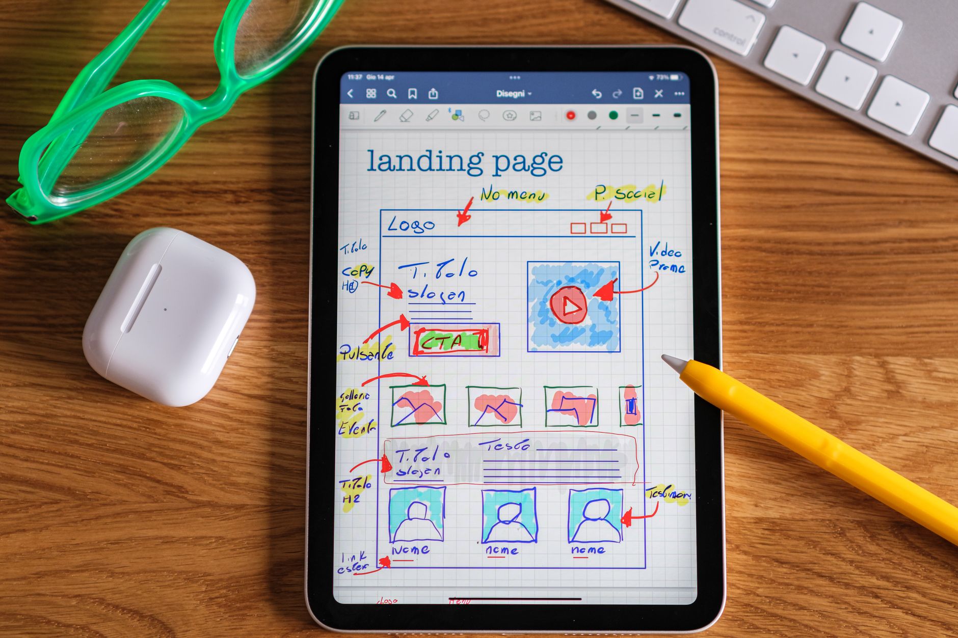
What landing page design best practices actually fix for B2B campaigns
Search for landing page design best practices and you will find long lists about hero images, color psychology, and animation trends. Useful for inspiration, less so when your goal is lower cost per qualified lead from search ads, email sends, or retargeting. On B2B campaigns, landing page problems show up as wasted media spend: clicks arrive, bounce rates spike, and sales hears leads that never understood the offer.
FunnelWon sees landing pages underperform when design treats them like brand brochures instead of decision environments. The page tries to serve every audience, repeats the full company story, and asks for commitment before credibility. Strong landing page design fixes four operational gaps:
- Offer clarity — one headline, one outcome, one primary action aligned with the ad or email that sent the visitor.
- Above-the-fold orientation — promise, specificity, and CTA visible before scroll on desktop and mobile.
- Proof sequencing — social proof placed where skepticism peaks, not stacked as a logo wallpaper.
- Friction control — forms, navigation, and mobile layout that preserve momentum toward conversion.
Landing pages sit at the intersection of strategy, content, and design. Message match between campaign and page is non-negotiable—if the ad promises a free audit, the hero must say audit, not "Welcome to our solutions." Get the offer and path right, then polish visuals. That order is how teams improve return on ad spend without adding hype.
Above the fold: one offer, one path forward
The above-the-fold zone is where landing page design best practices earn or lose the click you already paid for. Visitors decide in seconds whether this page matches their intent. Give them one offer and one path forward—not a menu of options.
Headline structure that matches campaign intent
Your H1 should complete the sentence the ad or email started:
- Who it is for — role, industry, or company stage when targeting is narrow.
- What they get — audit, demo, assessment, consultation, trial—not vague "solutions."
- Why now — one line of specificity: timeline, scope, or outcome metric.
Subheads support the promise; they do not introduce a second offer. If you need a secondary path, defer it below the fold as a text link—not a competing button in the hero.
Visual hierarchy in the first viewport
- Single-column priority on mobile — headline, one line of proof or specificity, primary CTA, then supporting visual.
- Split layout on desktop — copy left with CTA attached to the promise; proof visual or stat right—not a decorative stock photo with no meaning.
- Contrast reserved for action — one high-contrast button; neutrals everywhere else.
- Navigation stripped or minimized — remove global nav on paid landing pages when possible; every exit link steals conversion.
What to leave out of the hero
Avoid the mini-homepage trap: three equal CTAs, auto-playing video with sound, rotating carousels that hide the offer, and paragraphs of company history. B2B evaluators scanned your ad—they need confirmation and a next step, not a tour of every service line.
Pair hero structure with CTA best practices: outcome-focused button copy (Book a 20-Minute Strategy Call, Request My Audit) and microcopy under the button that sets expectations (no commitment, response within one business day). Above the fold is where message match lives or dies—audit it before you audit button color.
Form friction: fewer fields, clearer handoff
Forms are where landing page design best practices meet revenue operations. Every extra field filters out qualified buyers who were ready to talk. Every vague label or missing privacy note triggers abandonment. Design forms as part of the conversion path—not an iframe dropped in after the mockup is approved.
Field count and qualification logic
Start with the minimum viable data to start a conversation:
- High-touch B2B services — name, work email, company; phone optional unless speed-to-lead depends on it.
- Audit or assessment offers — URL or company name plus email; enrich firmographics in CRM after submit.
- Demo or trial requests — email and role; save team size for onboarding, not the landing page.
Multi-step forms can lift completion when the first step is low friction (email only) and later steps appear after commitment—but test against a single short form. More steps help only when each step feels like progress, not interrogation.
Layout and copy that reduce anxiety
- Labels outside fields — visible on mobile without tapping into the input.
- Button copy matches the offer — Request My Audit, not Submit.
- Microcopy under submit — response time, no-spam policy, what happens on the call.
- Privacy and compliance — link to privacy policy when collecting PII; required consent checkboxes only when legally necessary.
- Error states that help — inline validation, clear fix instructions, preserved field values on failure.
Form placement on the page
Two proven patterns for B2B landing pages:
- Inline form beside proof on desktop — evaluator reads promise and proof left, converts right without scrolling back up.
- Full-width form section after proof stack — better when the offer needs more context before the ask; repeat headline above the form for message continuity.
On mobile, stack fields full-width with generous touch targets (44px minimum). Hide sticky CTAs when the form is in focus so fields stay visible. Align form voice with your content standards so the handoff from headline to field feels continuous—not like marketing handed off to a generic HubSpot template.
If form fills are high but sales disqualifies most leads, the problem is often offer or targeting—not form design. If bounce rate is high and form starts are low, audit field count and above-the-fold clarity before you add more proof sections.
Mobile layout, speed, and landing page QA before launch
More than half of B2B ad clicks happen on mobile—even when contracts get signed on desktop. Landing page design best practices treat mobile as the primary layout, not a responsive shrink of the desktop comp. A broken mobile path wastes paid traffic you cannot get back.
Mobile layout essentials
- Single-column flow — headline, proof snippet, CTA, then supporting sections; no side-by-side columns that collapse into confusion.
- Thumb-friendly CTAs — full-width primary button, 44px+ height, adequate spacing from secondary links.
- Readable type — 16px+ body text, headlines that wrap cleanly on 375px screens.
- Click-to-call when appropriate — high-touch services where phone beats forms on mobile commutes.
- Sticky CTA with restraint — one label on a bottom bar; hide when form fields are active.
Speed is a design requirement
Slow landing pages break hierarchy before it starts. Compress hero images, defer non-critical scripts, and limit font weights. Test on real 4G devices—not only desktop Lighthouse in CI. A three-second delay erodes the trust your proof sections were built to create. For campaign pages tied to search ads, speed also affects quality score and cost per click.
Pre-launch checklist
- Message match: ad headline, landing H1, and CTA label tell the same story.
- One primary offer and one primary CTA label repeated at decision points.
- Compact proof above the fold; detailed proof before mid-page and pre-form CTAs.
- Form fields tested on mobile with real keyboard and autofill behavior.
- Navigation minimized; no competing exits unless required for compliance.
- Load under three seconds on mobile for key campaign URLs.
- Thank-you page or confirmation state matches the promise and sets next expectations.
When to redesign the landing page vs. the campaign
A/B testing button color cannot fix wrong offer, missing proof, or six competing actions. If baseline conversion is near zero, run a layout and messaging audit—often through conversion-focused design—before you rotate ad creative. When the page already converts, test hero headlines, proof placement, and form length with disciplined creative experiments.
Need landing pages that match campaign intent and convert on every device? FunnelWon builds conversion-focused websites and campaign landing pages with clear offers, proof in the right places, and mobile layouts that preserve one path forward. Explore the full Creative practice—strategy, content, design, and website work built to drive revenue.
FAQ
What is the most important landing page design best practice for B2B?
One offer, one path forward. Every element—headline, proof, form, and CTA—should support a single conversion goal aligned with the ad or email that sent the visitor. Mini-homepage layouts with multiple competing actions are the most common reason B2B landing pages waste paid traffic.
What should be above the fold on a B2B landing page?
Above the fold, show the campaign promise in the headline, one line of specificity or compact proof, and a single primary CTA. Avoid long company intros, multiple buttons of equal weight, and carousels that hide the offer. The visitor should confirm "this matches what I clicked" without scrolling.
How much social proof does a landing page need?
Enough to answer skepticism at the moment of decision—not a wall of logos. Start with one compact proof element above the fold (stat, testimonial snippet, or three recognizable logos). Place stronger proof—case metrics, full testimonials, process steps—immediately before CTA bands and forms where buyers actually decide.
How many form fields should a B2B landing page include?
As few as required to start a qualified conversation—often name, work email, and company for high-touch services. Enrich data in CRM after submit rather than front-loading every qualification question. Test form length against qualified lead rate, not raw submission volume.
Does mobile layout really affect landing page conversion rates?
Yes. A large share of paid clicks arrive on phones. If mobile layout hides the CTA, breaks the form, or loads slowly, you lose conversions before buyers return on desktop. Mobile-first landing page design uses single-column flow, thumb-friendly buttons, and fast load times so the same offer path works on every device.
Social proof: where credibility belongs on landing pages
Social proof is not decoration—it is layout infrastructure that answers "why should I trust you?" at the moment doubt would kill the conversion. Landing page design best practices place proof where evaluators look for reassurance, not where it fills whitespace.
Proof types ranked by B2B impact
Placement rules that keep proof working
Compact proof above the fold: one stat, three logos, or a single-line testimonial snippet—enough to signal credibility without crowding the CTA.
Decision-zone proof before each CTA band: repeat the primary button immediately after a proof block. B2B buyers convert after credibility clicks, not before.
Objection-specific proof near forms: if buyers worry about implementation time, show a timeline; if they worry about fit, show a case study from their vertical.
Proof patterns to avoid
Social proof must align with your positioning and the campaign promise. Inconsistency erodes trust faster than missing proof. When proof and offer match, you can run creative A/B tests on layout and headline—not rebuild credibility from scratch every test cycle.